Last year was all about bringing an edgier palette into the home–with vibrant reds, modern metallics, and variations of the statement black accent wall. Unlike 2018’s color trends, 2019 is taking a more mindful, lifestyle-based approach to the development of new shades. Most paint brands have released their colors of the year, including Benjamin Moore, PPG Paints, Sherwin Williams, and of course, Pantone’s 2019 Color of the Year: Living Coral. From powerful aquas to soft terracottas, companies are connecting the dots between consumers’ home lives, mental demands, and digital engagement, which inspired many of the color picks this year.
If you’re looking to kick-start your home refresh by indulging in new hues, check out 2019’s top color trends, along with how to use them in your own home now.
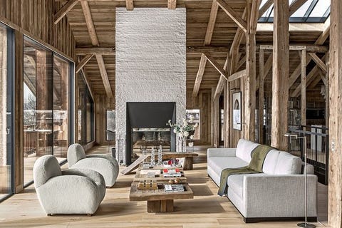
“While nature is a common inspiration for home décor, in 2019 we will see a shift from oversized botanicals to the woodlands, with mushroom grays and fern-inspired colors. Mushrooms will also continue to be a key shape in the home,” says Sue Wadden, director of color marketing at Sherwin Williams. “Their earthy color–gray blended with warm brown–gives off an old world, naturalist feel.”
SHOP THE COLOR
Shiitake, Sherwin Williams
SHOP THE LOOK
Crate & Barrel Mimi Vegan Lambskin Chair, $1,000
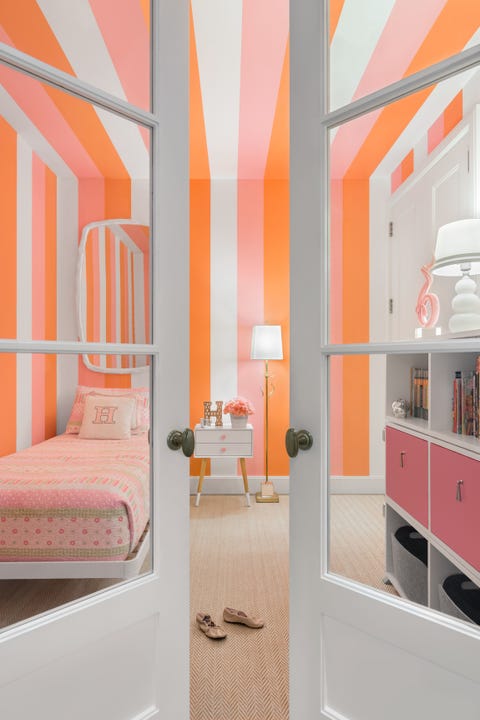
It only makes sense for Pantone’s 2019 color of the year–Living Coral–to be on your radar when you begin your home revamp. According to interior designer Carolyn Pressly, “We’ll be seeing more hopeful and optimistic colors in the home, as evidenced by the recent selection of living coral, Pantone’s color of the year. Instead of using coral literally, you can separate it into its orange and pink counterparts. In this windowless office converted into a little girl’s room, the mood instantly becomes energizing and uplifting.”
SHOP THE COLOR
Coral Reef, Sherwin Williams
SHOP THE LOOK
Coral Cotton Pouf, $79
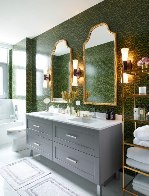
According to interior designer Becky Shea, hunter greens are a great choice for 2019. “Hunter green holds a sultry and worldly value to it, it’s intrinsic in nature and all of life. It’s timeless in every respect, and works beautifully with natural elements and neutral tones. What we also love about this color is how seamlessly it transitions between millwork, walls, furniture and accessories. Its gender neutrality also holds a special place in my heart, there’s no definition of a home feeling more masculine or feminine; it’s the perfect balance of each,” she says.
SHOP THE COLOR
Hunter Green, Benjamin Moore
SHOP THE LOOK
Schumacher Amazon Tortoise Wallpaper, Price Upon Request
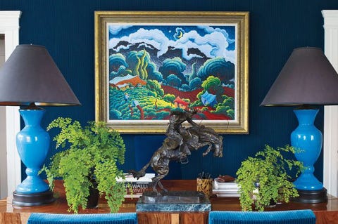
“Currently, I’m in love with the deep saturated colors,” says interior designer Keita Turner. “Beau Green, Kendall Charcoal, Hale Navy and Hunter Green. These darker moody colors are perfect for custom built-ins and kitchen cabinetry. I would ideally use them in a room with an abundance of natural light.”
SHOP THE COLOR
Hale Navy, Benjamin Moore
SHOP THE LOOK
Staytonville 24″ Table Lamp, $39
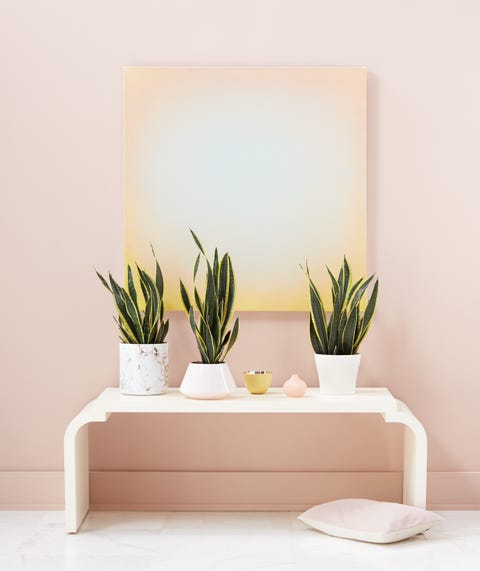
Pale pinks are prevailing in 2019 due to their neutral properties and compatibility with other shades. Interior designer Barbara Schmidt explains that “Monochromatic colorways–like this pink desert sand shade–will be popular in 2019. It can be mixed with an abundance of white or a lemon yellow for the ideal look.”
SHOP THE COLOR
Pale Pink Satin, Benjamin Moore
SHOP THE LOOK
Janiya Table Vase, $55
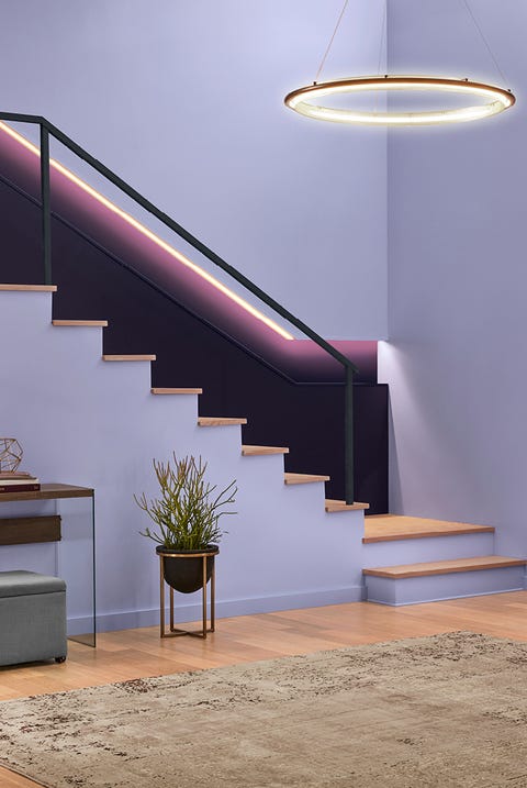
According to the Senior Color Designer Sue Kim of Valspar, “Smart technology in the home is driving the color experience differently.” Because of this, we will see higher intensity shades that mimic the edge of artificial light in a way that is “strangely familiar” (and obviously gorgeous).
SHOP THE COLOR
Twilight Mist, Valspar

Deep greens that are inspired by (but not directly reflective of) nature will bring the healing properties of the outdoors into the home, without feeling overly arboreal. Here, PPG’s color of the year “Night Watch” fills a room with a welcoming richness.
SHOP THE COLOR
Night Watch, PPG Paints
SHOP THE LOOK
Anthropologie Velvet Savonna Chair in Holly, $500
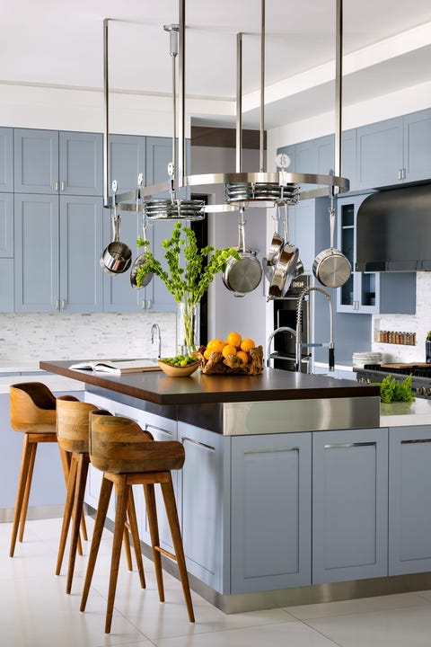
In 2019, we’re going to see blues with a softened mistiness and haze. This moody blue has a calming grey undertone that promotes a more serene energy in the home. According to Kim, blues can be given “a touch of purple to free our thinking, with hints of gray to ground us.” They selected Seattle Haze as one of their colors of the year.
SHOP THE COLOR
Seattle Haze, Valspar
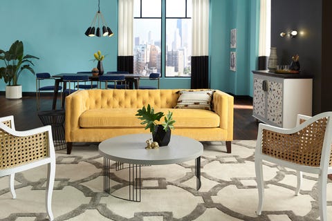
In 2019 we’ll see a rise in colors that are associated with optimism, like bold yellows and oranges. Sherwin Williams’ Afternoon, a rich and inviting yellow, pairs beautifully with cool blues, beiges, and pinks.
SHOP THE COLOR
Afternoon, Sherwin Williams
SHOP THE LOOK
Anthropologie Fan Pleat Sofa in Gold, $2,398
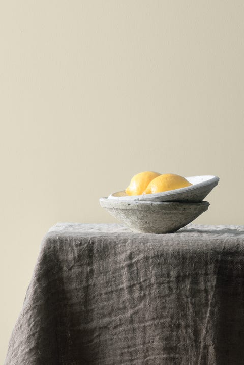
The minimalist movement has encouraged many modern homemakers to live a more clutter free, thoughtful life. With this, shades associated with minimalism–creams, beiges, and whites–are being incorporated into many home palettes. Cream shades with bolder, more colorful undertones are desired for their inherent simplicity that can be manipulated with different types of lighting. Here, see Benjamin Moore’s Balboa Mist, a timeless cream that shifts richer or deeper with shadow and brightness.
SHOP THE COLOR
Balboa Mist, Benjamin Moore
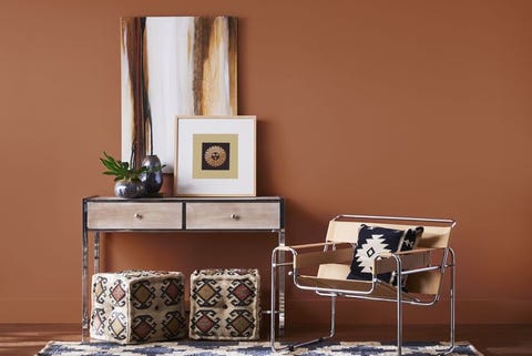
Sherwin Williams’ 2019 color of the year is Cavern Clay, which is a Southwest inspired tone. For those who want a more elemental, nature-inspired hue with a contemporary twist in their home, this creamy rust will truly shine.
SHOP THE COLOR
Cavern Clay, Sherwin Williams
SHOP THE LOOK
West Elm Slope Leather Lounge Chair in Saddle, $350
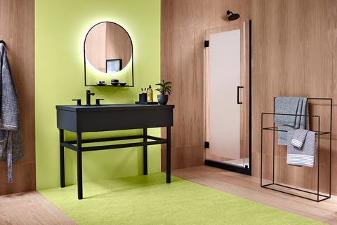
According to Valspar experts, playful, more extreme colors will be popular in 2019. The “I can do this, let’s make a change” attitude is reflected in electric tones like lime green, citrus orange, and bright yellow.
SHOP THE COLOR
Lime Mousse, Valspar
SHOP THE LOOK
Wayfair Lemon Lime Green Area Rug, $33

Millennial pink is a color of the (very recent) past. Now, softer shades like rosy neutrals and muted blushes, which reflect a spirituality, are being favored. Unlike millennial pink, these hues are less trendy and more timeless.
SHOP THE COLOR
Blushing Bride, Valspar
SHOP THE LOOK
Wayfair Mongolian Shaggy Fur Throw, $40

In 2019, bring pops of color into your favorite spaces with jewel-toned furniture and accents. 2018 was the year of the neutral palette, and 2019 is all about finding balance with appropriate doses of color. Kitchen cabinets, accent walls, and furniture are all smart ways to incorporate colors like emeralds, sapphires, and aquamarines.
SHOP THE COLOR
Reflecting Pool, Sherwin Williams
SHOP THE LOOK
Anthropologie Ombre Pillow, $215

Light, wood-inspired shades are a great alternative to traditional beiges or tans. Neutrals that take on ash, maple, or pine tones are perfect for the minimalists and color-phobics alike.
SHOP THE COLOR
Homey Cream, Valspar
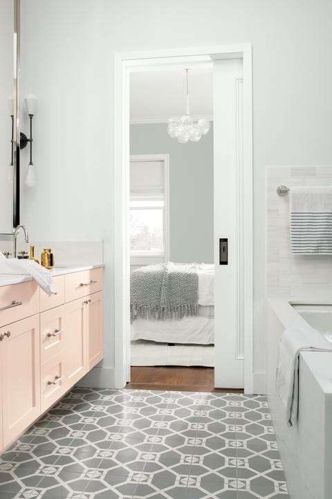
There’s nothing more classic than an all white palette. And while pure white is a go-to for many homemakers, 2019 will be the year of “almost-whites.” These shades offer subtle nuances that adapt to different lighting, furniture, and surrounding colors. For those who crave a minimalist palette that still feels dynamic, an almost-white shade is the fool-proof choice.
SHOP THE COLOR
Decorator’s White, Benjamin Moore
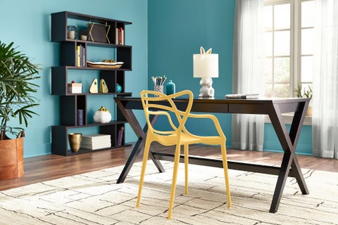
HGTV HOME by Sherwin Williams picked the vivid-but-calm Reflecting Pool as their 2019 color of the year. The vibrant aqua is bold on its own, but the versatile hue changes when paired with different colors (think soft pinks, pastels). While the color is easily toned down, Sherwin Williams paint experts see aqua being used as a power color in 2019: “It takes on a sense of humor and power, and is perfect for a fun accent wall, front door, or bookshelf,” the brand said.
SHOP THE COLOR
Reflecting Pool, Sherwin Williams
SHOP THE LOOK
Wayfair Aqua Vase, $82
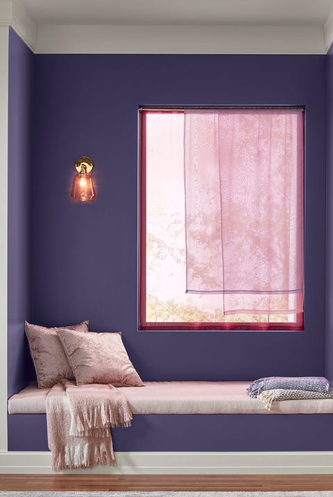
Pantone named Ultra Violet as their 2018 Color of the Year, and purple is expected to prevail in 2019 as well. Next year, however, we should expected muted, understated versions of the color that still have that rich energy, but with a mellowed intensity that makes the shade more versatile.
SHOP THE COLOR
Metropolis Lilac, Valspar
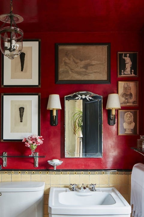
In 2019, expect to see bold, saturated reds that infuse life into a space without overwhelming it. Deep berries have comforting and cozy qualities, while simultaneously energizing a space with their rich color. HGTV HOME by Sherwin Williams included Borscht, a juicy berry tone into their Everyday Balance collection for 2019.
SHOP THE COLOR
Salute, Sherwin Williams
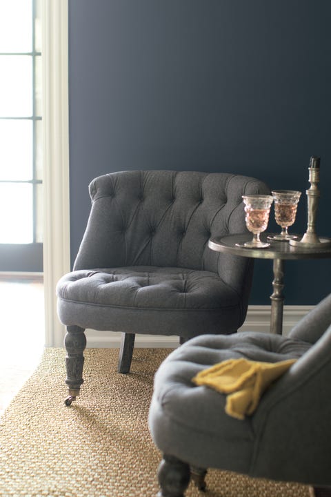
“People will begin to incorporate calm grey undertones, which are associated with mindful living and smart choices,” says Kim. These coined “introspective shades” regard a color’s undertone as equally important to the shade itself. Navys, purples, and browns with grey undertones create a subdued sense of tranquility in the home. Here, walls are painted in Benjamin Moore’s Black Panther.
SHOP THE COLOR
Black Panther, Benjamin Moore
SHOP THE LOOK
Crate & Barrel Midcentury Chair in Charcoal, $1099